🔥 React & Javascript Optimization Techniques - Part II

I am a developer creating open-source projects and writing about web development, side projects, and productivity.
In the previous article, we covered five techniques, including debouncing, throttling, memoization, bundle size optimization, and keeping the component state local when necessary. In this article, we'll explore the remaining four techniques. Without further ado, let's dive in.
The Dangers of Background Images
Assume you have code where you get images from the CMS.
These images should be background images that keep changing.
You approach it in a way where you map out the images and set them as background images.
import React from "react";

const BackgroundImages = ({ images }: { images: string[] }) => {
  return (
    <div className="flex">
      {images.map((image, index) => (
        <div
          key={index}
          className="w-32 h-32 bg-cover bg-center"
          style={{ backgroundImage: `url(${image})` }}
        />
      ))}
    </div>
  );
};

export default BackgroundImages;
Now, your code may look different, but this code is just to demonstrate the dangerous code.
When the browser receives an HTML document, it parses it from top to bottom, building the DOM tree.
If the parsers encounter a <script> tag referencing an external script, it stops parsing the HTML document and fetches the script. You don’t want this to happen. Solutions like async and defer are there to help.
When the parser encounters a <link> tag referencing a stylesheet, it requests that file. However, the parsing of the HTML document can continue. A new parser is started. This is the CSS parser. It builds the CSSOM (CSS Object Model) tree.
Why does the browser need the CSSOM tree?
Allow the browser to efficiently apply styles.
JavaScript can access and modify styles via the CSSOM API.
CSSOM is used in the critical rendering path, which is the sequence of steps the browser takes to convert HTML, CSS, and JavaScript into pixels on the screen.
What happens when the CSS parser encounters an external link?
It triggers a request and downloads the file. It blocks the CSS parser from continuing.
If you think about this, this “blocking” is a serious issue. It prevents the critical rendering path from being completed because we need the CSSOM tree to complete it.
DOM size optimization
The Document Object Model (DOM) represents the structure of a web page, and the size of this structure directly impacts a React application's performance. Large and complex DOM trees can slow down rendering and increase memory usage.
Let's explore some techniques that can be used to optimize the DOM.
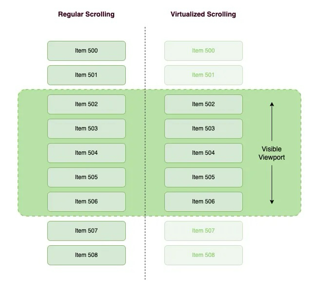
Windowing or list virtualization in React applications
Imagine we have a very long list of data, whether or not any of them is displayed in the browser viewports, they will render in the DOM and then the DOM will become very large. That may have a bad effect on the performance of our applications.
The question is "How do we improve it?". We all know that we only need to see data on the browser viewport. Therefore, we will only render the visible portion for the user to the DOM. Then, when scrolling, the remaining list items render while replacing the items that exit the viewport. To better understand this technique, consider the following example:
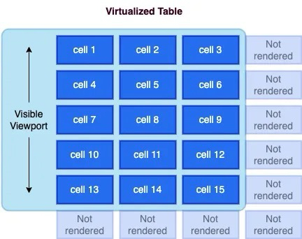
Virtualization can also be applied to tables, where both rows and columns can be virtualized and achieve significant performance improvements.
You can implement windowing in your React app by utilizing libraries like react-window or react-virtualized. Here's an example:
import { VariableSizeList as List } from 'react-window';

const data = [...]; // Your list of data

const RowRenderer = ({ index, style }) => {
  return <div style={style}>{data[index]}</div>;
};

const VirtualizedList = () => {
  return (
    <List
      height={500}
      itemCount={data.length}
      itemSize={(index) => 50} // Row height
      width={300}
    >
      {RowRenderer}
    </List>
  );
};
Avoid complex nesting
Every DOM element increases the rendering cost. Minimizing the DOM is necessary to reduce this cost. Furthermore, optimizing HTML might help us code faster, avoiding minor UI bugs.
There are some examples of minimizing the DOM:
Use Fragment: When no container node is needed, use a <Fragment>(usually <>...</>) to group them.
Use Semantic HTML: Utilize semantic HTML to convey the structure effectively while keeping the DOM hierarchy shallow. For example, instead of multiple nested div elements, use semantic tags like <header>, <main>, <section>, and <footer>.
// COMPLEX NESTING ❌
<div className="container">
  <div className="content">
    <div>
      Content
    </div>
  </div>
</div>

// SIMPLIFIED STRUCTURE ✅
<main className="container">
  <section className="content">Content</div>
</div>
Use Inline Styles Sparingly: Instead of applying inline styles to individual elements, consider using CSS classes or styled-components. Inline styles can bloat your HTML and make it harder to maintain.
Optimize Lists: When rendering lists, use the key prop to help React efficiently update and re-render list items. Avoid using array indexes as keys when possible, as this can cause unnecessary re-renders.
import React from 'react';

const MyComponent = ({ items }) => {
  return (
    <ul>
      {items.map((item) => (
        <li key={item.id}>{item.name}</li>
      ))}
    </ul>
  );
};

export default MyComponent;
Optimize Accessing DOM
Before diving into reflow and repaint, here’s the rendering pipeline at a glance:
flowchart Left to Right
    [HTML + CSS] -->|1. Parse| [DOM + CSSOM]

    |2. Combine| [Render Tree] (Contains elements which are visible)

    |3. Calculate| [Layout / Reflow]

    |4. Draw| [Paint / Repaint]

    |5. Show| [Composite & Display]
When something changes after the initial render, the browser decides whether it needs to recalculate layout (reflow), update pixels (repaint), or both.
What is Reflow?
A reflow (also called layout) happens when the browser recalculates the position and geometry of elements on the page.
It triggers when you change anything that affects an element’s size, position, or structure:
Width, height, padding, margin, border
Font size or font family
Adding or removing DOM elements
Changing
displaypropertyResizing the browser window
// Both of these trigger reflow
element.style.width = "300px";
container.appendChild(newDiv);
> Why it’s expensive: Reflows cascade. Changing one element can force the browser to recalculate layout for its children, siblings, and even parents.
What is Repaint?
A repaint happens when you change an element’s appearance without affecting its layout. The browser just redraws the pixels — no geometry recalculation needed.
Triggers include:
background-colorcolorbox-shadowoutlinevisibility
> Why it’s cheaper: The browser skips the layout step entirely and goes straight to painting pixels.
What is Composite?
Certain CSS changes (transform, opacity) are GPU-accelerated, affecting only compositing layers instead of full layout/paint. This is much cheaper.
Tip: Use transform and opacity for animations instead of top, left, or width.
Strategies to Optimize DOM Access
// Triggers REFLOW + REPAINT (element is removed from layout)
element.style.display = "none";
// Triggers only REPAINT (element is invisible but still occupies space)
element.style.visibility = "hidden";
Batch your style changes
// Bad — triggers reflow on EACH line
element.style.width = "100px";
element.style.height = "200px";
element.style.margin = "10px";
// Good — one reflow via cssText
element.style.cssText = "width: 100px; height: 200px; margin: 10px;";
// Good — one reflow via class toggle
element.classList.add("resized");
Avoid layout thrashing
Layout thrashing happens when you read and write layout properties in a loop, forcing the browser to reflow on every iteration.
// Bad — forces reflow on every read
for (let i = 0; i < items.length; i++) {
  items[i].style.width = container.offsetWidth + "px"; // read + write in loop
}
// Good — read once, then write
const width = container.offsetWidth;
for (let i = 0; i < items.length; i++) {
  items[i].style.width = width + "px";
}
Other tips
Use
transformandopacityfor animations (these skip reflow AND repaint — they run on the compositor)Avoid deeply nested DOM trees — reflows cascade further
Use
position: absoluteorfixedfor animated elements to take them out of document flowReduce CSS selector complexity
Make any website load faster with 6 lines of HTML
<script type="speculationrules">
  {
    "prerender": [{ "where": { "href_matches": "/*" }, "eagerness": "moderate" }],
    "prefetch": [{ "where": { "href_matches": "/*" }, "eagerness": "moderate" }]
  }
</script>
Ever clicked a link and had the next page appear almost instantly? That magical, speedy experience is becoming easier to achieve thanks to the Chrome Speculation Rules API. This new feature browser helps make navigation feel instant with just a few lines of HTML.
How does it work?
The Chrome Speculation Rule API allows developers to declaratively tell the browser which pages to preload or prerender, providing a near-instant loading experience:
“prefetch“: tells the browser to only download the top-level HTML document for a linked page. It doesn’t render the page or fetch its sub-resources. This is less resource-intensive than prerendering but still saves time by having the HTML ready in the cache.
“prerender“: instructs the browser to not only download the page but also to fully render it in the background. This includes fetching all sub-resources like CSS, JavaScript, and images, and executing the JavaScript. When the user clicks the link, the page can be swapped into view almost instantly.
“eagerness“: “moderate“ is interpreted by the browser as: “Start the action 200ms after the user hovers their mouse pointer over the link“

Here’s a typical scenario:
A user is reading a page on your website
They move their mouse cursor and let it rest over a link (e.g., “Services“)
This browser interprets this hover as a sign of intent. After a very brief delay (e.g., ~200 milliseconds, to avoid firing on accidental mouse-overs), it triggers the prerender or prefetch action for the “Services“ pages.
If the user then clicks the link, the page is already loaded (or at least partially loaded) in the background, resulting in a near-instant navigation.
Limitations
Speculation Rules API is supported only in Chrome 121 and later versions.

For Firefox and Safari users, we created a short script to preload pages on hover so that they can be cached by the browser and reused once the hovered link is clicked. This also allows for near-instant navigation on browsers that do not support the Speculation Rules API. Heavy pages like the API might take a bit longer to load comparing to Chrome due to the lack of a pre-rendering mechanism natively supported by other browsers.
<script>
  if (!HTMLScriptElement.supports || !HTMLScriptElement.supports('speculationrules')) {
    const preloadedUrls = {};

    function pointerenterHandler () {
      if (!preloadedUrls[this.href]) {
        preloadedUrls[this.href] = true;

        const prefetcher = document.createElement('link');

        prefetcher.as = prefetcher.relList.supports('prefetch') ? 'document' : 'fetch';
        prefetcher.rel = prefetcher.relList.supports('prefetch') ? 'prefetch' : 'preload';
        prefetcher.href = this.href;

        document.head.appendChild(prefetcher);
      }
    }

    document.querySelectorAll('a[href^="/"]').forEach(item => {
      item.addEventListener('pointerenter', pointerenterHandler);
    });
  }
</script>
In order for this script to work on Firefox and Safari, pages should contain a Cache-Control header with a max-age value so that the preloaded page is cached on hover and then reused on link click.
Applying Web Workers in React
Have you ever faced a situation in which you are executing a block of code, and it freezes the UI for a few seconds? If not, you should try running such a code block in your browser console.
const start = Date.now();
while (Date.now() < start + 5000) {console.log("hihi")}
You might notice that your browser freezes, right? This is a similar result to what happens when executing a very expensive function, such as creating 25,000 user records. You probably wouldn't want your users to experience such a poor performance. Therefore, you need a solution to handle such code blocks in the background.
In React, we have a simple way to perform these types of CPU-intensive processes in the background with the help of web workers. But first, what is a web worker?
A web worker is a JavaScript feature that allows you to run scripts in the background, separate from the main thread of your web page. This background execution enables you to perform tasks concurrently without blocking the user interface (UI) or causing it to become unresponsive. Web workers are particularly useful for handling computationally intensive or time-consuming operations without impacting the user experience.
The use cases for the web worker are:
Complex Calculations: Web workers are ideal for performing complex mathematical calculations or data processing tasks without impacting the main thread.
Large Data Handling: When dealing with large datasets or files, web workers can help process and parse the data in their background.
Background Services: Web workers can be used to run background services such as periodic data synchronization or background notifications.
So, Let's try to implement a web worker in a React application:
export default function App() {
  const [noOfTomatoes, setNoOfTomatoes] = useState(0);
  const [noOfApples, setNoOfApples] = useState(0);

  const addApples = () => {
    const start = Date.now();
    while (Date.now() < start + 5000) {}
    setNoOfApples(noOfApples + 1);
  }
  return (
    <main>
      <p> Tomato: {noOfTomatoes} | Apple: {noOfApples} </p>
      <div>
        <button onClick={() => setNoOfTomatoes(noOfTomatoes + 1)}>
          Tomato
        </button>
        <button onClick={() => addApples()}>Apple</button>
      </div>
    </main>
  );
}
In the code snippet above, nothing happens if we click on the Tomato button. However, when we click on the Apple button, the browser freezes. This occurs because the condition inside the while loop always returns true, causing it to block the UI.
Let's fix the blocking effect by using a web worker to handle the addApples functionality:
//apple-worker.js

self.onmessage = async ($event) => {
    if (\(event && \)event.data && $event.data.msg === 'increaseAppleCount') {
        const newCounter = addApples($event.data.noOfApples);
        self.postMessage(newCounter);
    }
};

function addApples(noOfApples) {
    const start = Date.now();
    while (Date.now() < start + 5000) {
    }
    return noOfApples + 1;
}
onmessage serves as the entry point of the web worker and acts as the listener we trigger in the app. If an event containing data with the property msg (in this case, increaseAppleCount) is received, we invoke the addApples function to increase the number of apples.
Finally, we return the value of the count to the application through postMessage(). Subsequently, we utilize the Apple worker we created in the UI:"
function App() {
  const [noOfTomatoes, setNoOfTomatoes] = useState(0);
  const [noOfApples, setNoOfApples] = useState(0);

  useEffect(() => {
    appleWorker.onmessage = ($event) => {
      if (\(event && \)event.data) {
        setNoOfApples($event.data);
      }
    };
  }, []);

  function addApples() {
    appleWorker.postMessage({
      msg: "increaseAppleCount",
      noOfApples: noOfApples,
    });
  }
  return (
    <main> ... </main>
  );
}
In the useEffect, we register a listener that updates the noOfApples when the web worker emits a result. Finally, we modify the addApples function to invoke the web worker. With this setup, the app can execute multiple processes simultaneously without blocking the UI rendering.
Asset Optimization
The HTTP Archive found that at least 70% of all websites have an image as the most prominent. Optimizing your website assets is vital for improving website loading speed and getting better at FCP, LCP, and CLS. Large, unoptimized assets can drastically increase page load times and consume unnecessary bandwidth. Let's look at ways to optimize assets in our web apps.
Serving Images And Videos Properly
Here are some practices to consider when handling images and videos in your projects:
Use the right format: Choosing the right image format for each type of image can significantly impact the image's file size and quality. Here's the list of different image formats that you can choose for your project.
WebP
WebP is an image format developed by Google that offers better compression and small file sizes compared to JPEG and PNG. It's supported by modern browsers (excluding some versions of Safari and Internet Explorer). To use WebP, you can provide both WebP and fallback formats like JPEG or PNG in your HTML.
<!-- 👇 Set image sources with different formats in the `srcSet`
      the attribute in order of preference -->
<!-- 👇 Fallback image source for browsers that don't
      support srcSet in `src` attribute  -->
<img
 srcset="car.webp, car.jpg"
 src="car.jpg"
 alt="Car"
/>
JPEG 2000
JPEG 2000 is another high-quality image format with good compression. However, Its support in browsers is limited. Similar to WebP, you can provide JPEG 2000 version and fallback formats.
<img
 srcset="car.jp2, car.jpg"
 src="car.jpg"
 alt="Car"
/>
AVIF
AVIF is a newer image format that provides excellent compression and image quality. It is supported in modern browsers like Chrome and Firefox.
<img
 srcset="car.avif, car.jpg"
 src="car.jpg"
 alt="Car"
/>
While WebP and AVIF are supported in modern browsers, JPEG 2000 has limited support. Therefore, It's essential to test your website or application across browsers.
Serve Responsive Images
Responsive images allow you to serve different images based on the user's device and screen size. This prevents large images from being loaded on smaller screens, saving bandwidth. Use the
srcsetand sizes attributes in theimgelement to achieve this:<img src="img.jpg" alt="" sizes="(max-width: 63.9375em) 100vw, (min-width: 64em) 750px" srcset="img/content/small.jpg 480w, img/content/medium.jpg 750w, img/content/large.jpg 1024w" />sizes: Defines the viewport sizes and corresponding image widths to determine which image source to use based on the available space. It consists of two parts:(max-width: 63.9375em) 100vw: If the viewport width is less than or equal to63.9375em(around 1023px), The image will take up the full viewport width (100vw).(min-width: 64em) 750px: If the viewport width is greater than or equal to64em(around 1024px), The image will have a fixed width of750px.
srcset: Specifies a list of image sources with their corresponding widths, separated by commas. This allows the browser to choose the most appropriate image is closest to the width descriptor source based on the device's pixel density and viewport width. Each source is followed by its intended width in pixels (wunit).img/content/small.jpg 480w: Specifies an image source (small.jpg) with a width of480px.img/content/medium.jpg 750w: Specifies an image source (medium.jpg) with a width of750px.img/content/large.jpg 1024w: Specifies an image source (large.jpg) with a width of1024px.
Lazy loading
Lazy loading is a technique used to defer the loading of offscreen images until they are needed. This optimization can reduce initial page load times, especially for the web page with multiple images.
React supports lazy loading through the lazy attribute in the
imgtag:import React from 'react'; const LazyImage = () => { return ( <img src="image.jpg" alt="Description" loading="lazy" width="200" height="150" /> ); };This is just a simple way to lazy load images. In more complex scenarios, you might want things like:
An image placeholder during the loading
Effects like blurring during the loading
Setting specific thresholds for loading image
For these scenarios, you can make use of libraries like react-lazy-load-image-component.
Important: Do not lazy load any images(such as your website's logo or hero images) visible in the user's initial viewport. This approach ensures your website's critical images are immediately visible, which improves your page load time.
Compress images and videos: Utilize compression tools or plugins to compress your images or videos before deploying them to production. Tools like ImageOptim or TinyPNG for images and HandBrake or FFmpeg for videos can reduce file sizes without compromising quality.
Replace Animated GIFs with video: Animated GIFs are large files and can slow down page loading. Consider replacing animated GIFs with video formats(such as MP4) for smoother animation and faster page loads. Video generally offers better compression and can be auto-played or controlled based on user interactions.
Preloading LCP Image and Caching:
An LCP image is the largest image element on the webpage rendered within the user's initial viewport. By preloading this image, you can ensure it's available in the browser cache and ready to be displayed when it enters the user's viewport. This can significantly improve the LCP metric and perceived page loading speed.
<!DOCTYPE html>
<html lang="en">
    <head>
        ...
        <link
            rel="preload"
            fetchpriority="high"
            as="image"
            href="/path/to/hero-image.jpg"
        />
    </head>
    ...
</html>
The
<link>element with therel="preload"attribute is used to initiate the preloading process. Here is the breakdown of the attributes used in the<link>element.rel="preload": Specifies that the browser should preload the resource.fetchpriority="high": Indicates a high priority for fetching the specified resource. This helps the browser prioritize the preloading of this resource over others.as="image": Specifies the type of resource being preloaded, in this case, an image.href="/path/to/hero-image.jpg": Specifies the path to the LCP image file that needs to be preloaded.
In the React app, you can use the react-helmet package to add the preload link in the HTML head section for critical images.
import React from 'react';
import { Helmet } from 'react-helmet';
import PreloadImage from './assets/preload-image.png';

const ImageComponent = () => {
  return (
    <>
      <Helmet>
        <link rel="preload" href={PreloadImage} as="image" />
      </Helmet>
      <img src={PreloadImage} alt="Preload image alt" />
    </>
  );
};
Additionally, consider using service workers to cache images for subsequent visits. The following is a basic example of using a service worker to cache images:
// Service worker code (sw.js)
self.addEventListener('install', event => {
  event.waitUntil(
    caches.open('images-cache').then(cache => {
      return cache.addAll([
        'image.jpg',
        'other-image.jpg',
        // Add more images to the cache here
      ]);
    })
  );
});

self.addEventListener('fetch', event => {
  event.respondWith(
    caches.match(event.request).then(response => {
      return response || fetch(event.request);
    })
  );
});
Serve Images and Videos with Correct Dimensions
Specifying the image's dimensions in HTML or CSS is essential to prevent layout shifts and improve page rendering speed. By specifying the image's dimensions in HTML or CSS, you provide the browser with the necessary information to allocate the correct space for the image during the initial rendering process.
Benefits:
Prevents Layout Shifts: Specifying the dimensions ensures that the browser knows the image's exact size before loading it, preventing sudden layout shifts.
Faster Page Rendering: With the image dimensions known in advance, the browser can render the layout more efficiently, leading to faster page loading times.
Improved User Experience: By eliminating layout shifts, users have a more consistent and pleasant browsing experience.
To specify the image dimensions, you can directly include the width and height attributes within the
imgtag or apply a specific style by adding a class attribute to theimgtag in CSS.<img src="logo.jpg" alt="logo" width="300" height="200" /> <!-- or --> .logo { width: 300px; height: 200px; } <img src="logo.jpg" alt="logo" class="logo" />Use SVG for icons and logos
SVGs are simple ideas for icons and logos because they are vector-based and can be scaled without losing quality.
<!-- logo.svg -->
<svg width="100" height="100" viewBox="0 0 100 100">
  <circle cx="50" cy="50" r="40" fill="blue" />
</svg>

<!-- index.html -->
Using SVGs for logos and icons provides a lightweight, scalable, and visually appealing solution that improves web page performance, ensures crisp visuals, and enhances the overall user experience across various devices and browsers.
Image Sprites
An image sprite sheet in a single image that contains multiple smaller images and icons. It's used to reduce the number of HTTP requests when rendering numerous small images on the web page. By loading a single sprite sheet, you can display specific images by adjusting the CSS
background-position.Suppose you are building a social media web application and want to display various icons for actions such as liking a post, commenting, and sharing. Each icon is a small image that is typically used in different parts of the application.
Without Image Sprites:
In a traditional approach, you would include each icon as a separate image file in your HTML or CSS, like this:
<!-- Separate images for each icon -->
<img src="like-icon.png" alt="Like">
<img src="comment-icon.png" alt="Comment">
<img src="share-icon.png" alt="Share">
<!-- and so on... -->
With Image Sprites:
Using image sprites, you can combine all these icons into a single sprite sheet, reducing the number of HTTP requests. Here is an example of how it would look:
/* CSS using image sprites */
.icon {
  background-image: url("icons-sprite.png");
  background-repeat: no-repeat;
}

.like-icon {
  background-position: 0 0;
  width: 24px;
  height: 24px;
}

.comment-icon {
  background-position: -24px 0;
  width: 24px;
  height: 24px;
}

.share-icon {
  background-position: -48px 0;
  width: 24px;
  height: 24px;
}

/* and so on... */
<div class="icon like-icon"></div> <div class="icon comment-icon"></div> <div class="icon share-icon"></div>In this example, all the icons(like, comment, share) are combined into a single icons-sprite.png sheet. The CSS classes(.like-icon, .comment-icon, .share-icon) use the background-position property to display the correct part of the sprite sheet as the background for each icon.
Benefits:
Instead of loading multiple image files, the web application now loads just one image(icons-sprite.png), reducing the number of HTTP requests.
The sprite sheet is loaded once and can be cached by the browser, improving subsequent page loads.
CSS classes control the display of individual icons from the sprite sheet, allowing for seamless hover and rollover effects without additional loading delays.
This leads to faster and more efficient user experiences with improved overall page loading times.
Those are useful links about image optimization you should checkout: A Practice Guide for Web Developers to Optimize Images.
Preconnect to 3rd Party Hosts
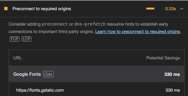
Third-party(3P) hosts are external servers or domains that provide services, assets, or resources a website uses. Examples include social media platforms, content delivery networks(CDNs), and external font services like Google Fonts.
By pre-connecting to these 3P hosts, you are instructing the browser to establish early connections to them by performing all of the handshake (DNS+TCP for HTTP, and DNS+TCP+TLS for HTTPS origins) for those origins, reducing the latency when the actual resources are made.
These origins should be cross-origin. It has no benefit on same-origin requests because the connection is already open.
These origins are actually ones that you need on page load and are used on almost all pages of your application.
Consider a scenario where your application relies on Google Fonts to style its text. To optimize the loading of the fonts, you can pre-connect to these domains. Here's how you can do it.
<!-- /index.html -->
<!DOCTYPE html>
<html lang="en">
<head>
  <!-- Other head elements -->

  <!-- Preconnect to Google Fonts and link to the stylesheet -->
  <link rel="preconnect" href="https://fonts.googleapis.com">
  <link rel="preconnect" href="https://fonts.gstatic.com" crossorigin>
  <link rel="stylesheet" href="https://fonts.googleapis.com/css2?family=YourFontFamily">

  <!-- Your other stylesheets and scripts go here -->
</head>
<body>
  <!-- React application content -->
</body>
</html>
In the above example:
The
<link>tags with therel="preconnect"attribute establish an early connection to Google Font's domainThe
hrefattributes specify the domain URL.The
crossoriginattribute is added for security reasons, ensuring the pre-connection adheres to the browser's CORS(Cross-Origin Resource Sharing) policies. If the server is cross-origin but doesn’t require CORS headers (like for images or scripts that don’t need CORs), you should omit thecrossoriginelse the pre-connection would be of no use and the browser would be forced to establish a connection again.The last
<link>tag imports the desired font styles into your application.
Before pre-connect:

After pre-connect:

That’s around 0.4s faster page loads already.
Using a content delivery network(CDN)
A Content Delivery Network (CDN) is a network of servers distributed across various geographic locations, strategically positioned to deliver web content to users more efficiently.
A CDN helps to improve website performance, reduce latency, increase reliability, and enhance security by delivering web content more efficiently to users around the world.
By hosting your assets on CDN providers like Cloudinary, CloudFront, CloudFlare, etc, you ensure fast and efficient delivery for visitors across the globe.
Preload critical assets to improve loading speed
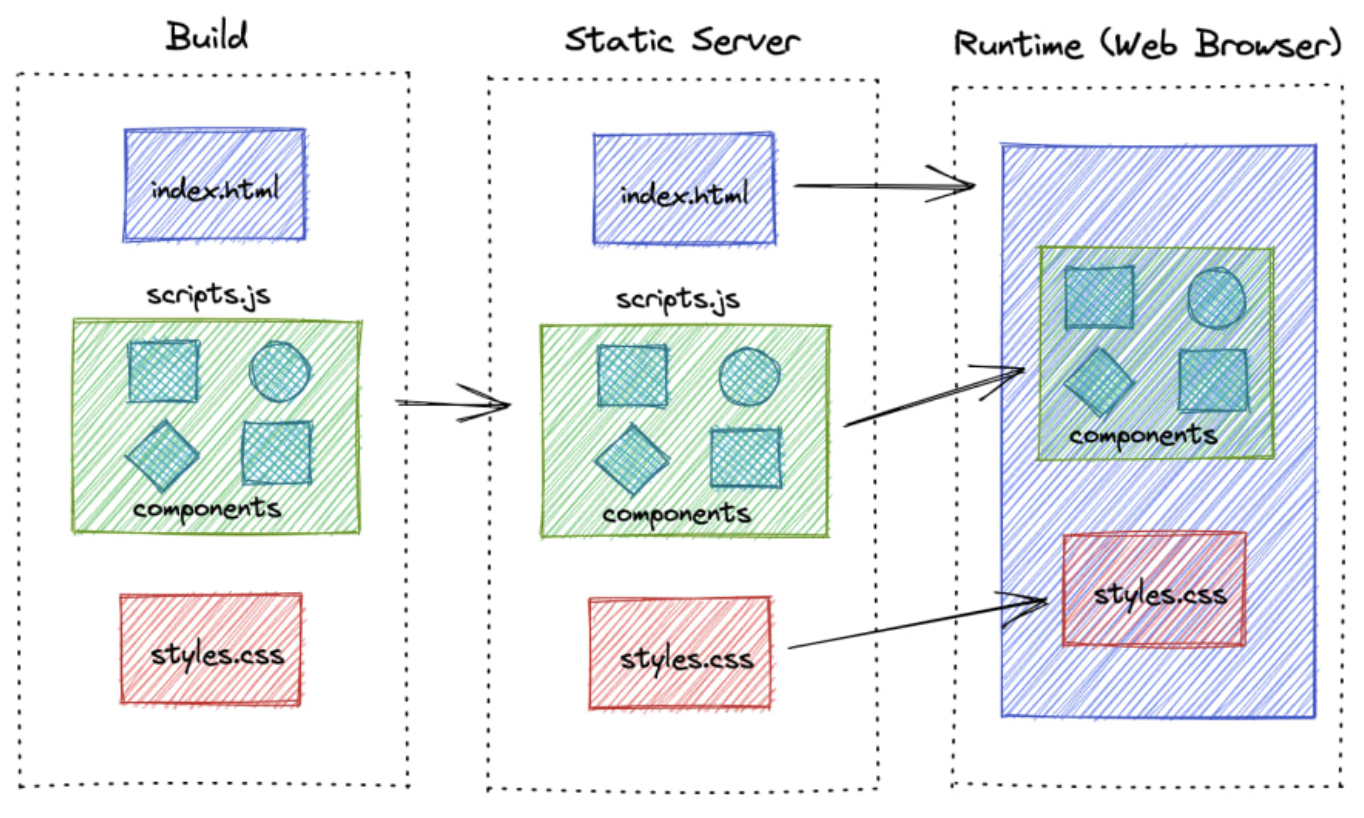
When you open a web page, the browser requests an HTML document from the server, parses its contents, and submits separate requests for any referenced resources. As a developer, you already know all the resources your page needs and which of them are important. You can use that knowledge to request critical resources ahead of time and speed up the loading process.
For more details, check out this article.
Rendering patterns
Rendering patterns in React applications play a vital role in shaping how your application is delivered to clients. Common rendering patterns like client-side rendering (CSR), server-side rendering(SSR), etc have distinct advantages and use cases. Let's explore these rendering patterns, understand how to implement each, and know when to use them.
Client-side rendering
Most web applications like Angular or React support out of the box. This is commonly suitable for single-page applications (SPA) or applications with a lot of interactions (e.g Games) and highly dynamic content such as forms, and chat applications.
Basically, the initial HTML is minimal, the server only sends to the client a blank page that contains the minimal HTML and CSS to bootstrap the application. Most of the rendering and logic execution occurs in the client's browser.
Server-side rendering
The main disadvantage of CSR is that is not Search Engine Optimized. Therefore, most of the web frameworks, provide the ability to render the server pages as well.
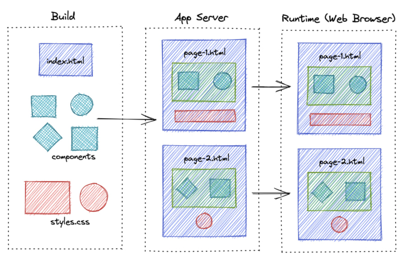
Unlike CSR, React components are rendered on the server side in response to a user request. The server sends the pre-rendered HTML and any necessary Javascript to the client, providing a complete page. Once the client receives the HTML, it can hydrate the page, adding interactivity by attaching event listeners and setting up the React application.
Static site generation
The difference between server-side rendering and static site rendering lies in how React components are rendered. In server-side rendering, the React components are rendered for each request. To avoid this, we can generate these files during build time so that we can serve pages instantly when a user requests them.
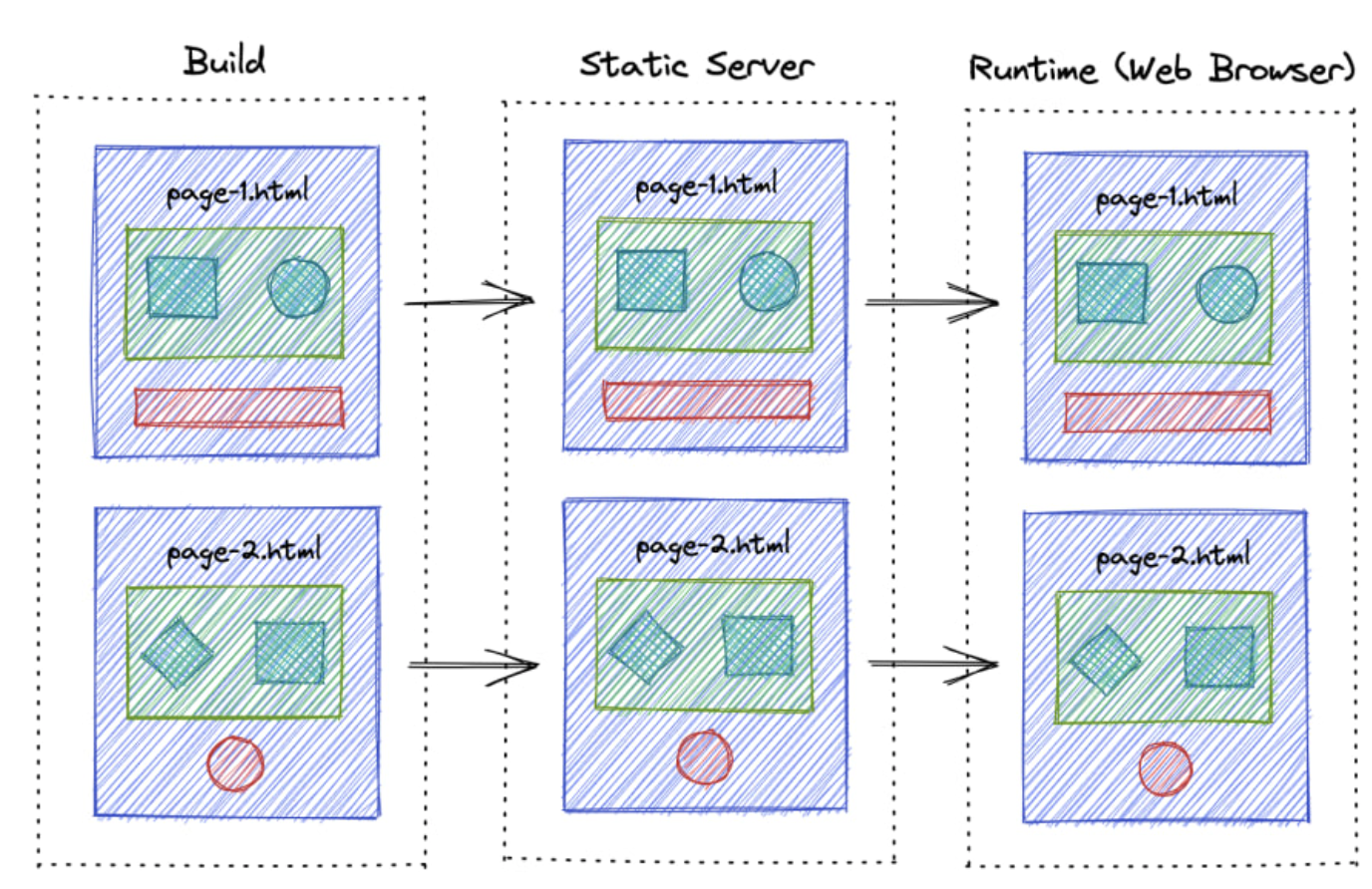
This technique is particularly useful for building web applications with predominantly static content, such as a blog. However, one drawback is that the content might become outdated, requiring the application to be rebuilt and redeployed each time the content is changed.
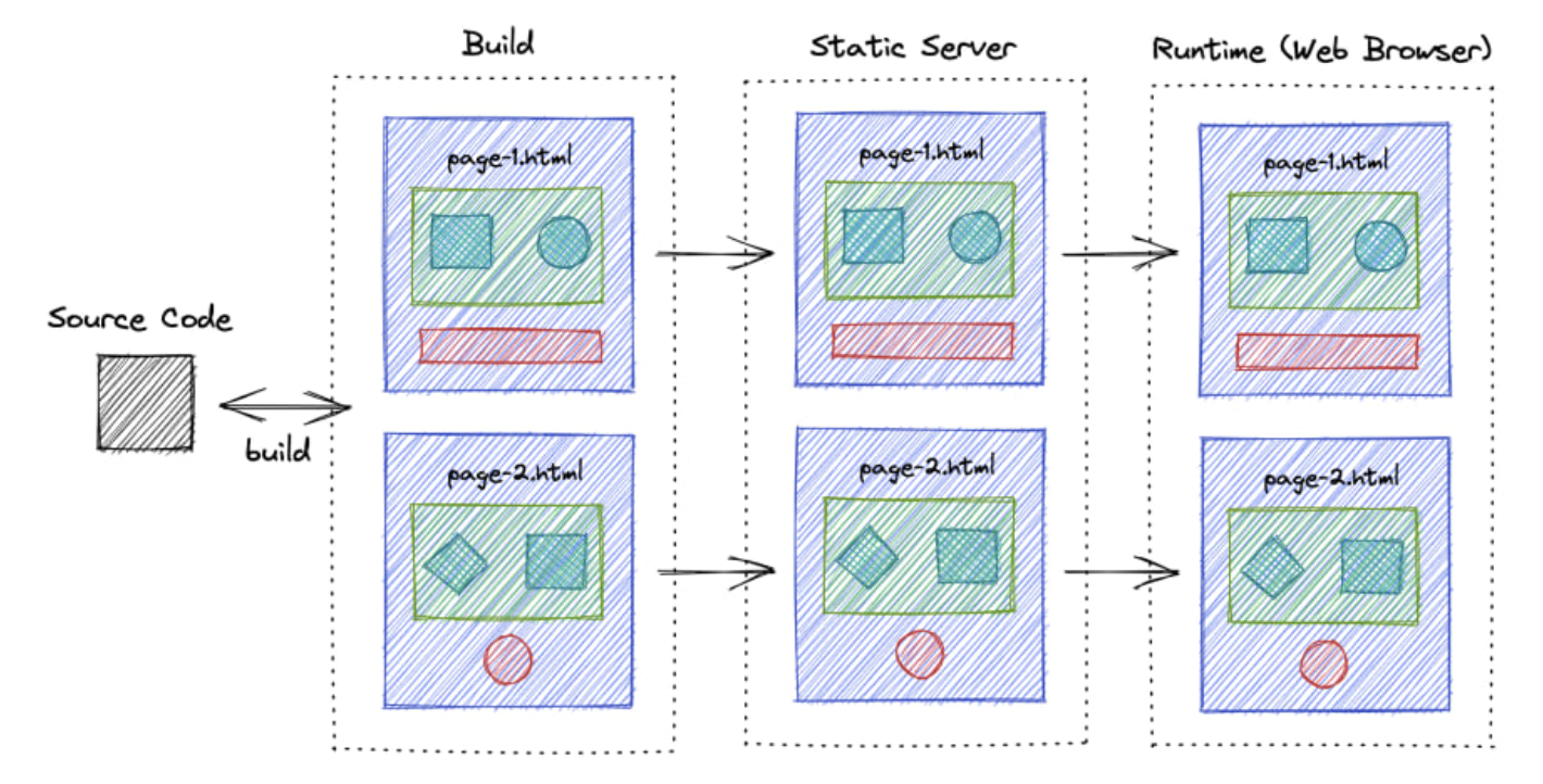
Incremental Static Regeneration
ISR is the next improvement to SSG, where it periodically builds and revalidates the new pages so that content never gets too outdated.
Comparison
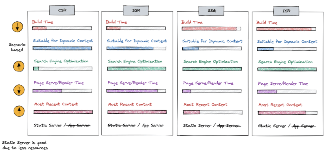
At a high level, we can divide these rendering techniques into two major categories based on the level of dynamic interactions that your app has.
CSR and SSR can be used to develop highly dynamic web applications and both have their pros and cons depending on the scenario.
If you have highly static content, you can use SSG or ISR. ISR is more advanced and optimized, but it requires specific platforms to work.
Front-end Performance Checklist
In the speed-obsessed world of today, better performance translates directly into business gains. You only have about 8 seconds (source link) — that is the average human attention span — before the user loses concentration. From that stat alone, it’s obvious why website performance matters. No?
Google found that 53% of mobile visitors abandon a site that takes longer than 3 seconds to load (source link).
And nearly 50% of consumers admit that page speed influences their likelihood to buy (source link).
Faster sites see more engagement and higher conversion rates — for example, Walmart observed up to a 2% increase in conversions for every one second of improvement in page load time (source link)
Performance also plays a crucial role in retaining users (fewer will bounce) and ensuring a pleasant user experience, which boosts customer loyalty. It even affects your search engine ranking (Google uses page speed/ Core Web Vitals as a ranking signal) and impacts your Google Ads Quality Score (slow landing pages can raise ad costs). In short, web performance influences:
Time on site (users stay longer on fast sites)
Page views (users view more pages when each loads quickly)
Bounce rate (slow pages cause users to leave)
Conversions / Revenue (speed encourages purchases – milliseconds can be millions)
User satisfaction and retention
Organic search traffic (page experience is an SEO factor)
Bandwidth/CDN costs (efficient sites use less data)
Ad Quality Score (fast landing pages improve ad performance)
Having all these benefits in mind, it pays off to have a performant website, right? So, how do you achieve that?
Measuring Performance
Before diving into the checklist, start by measuring your website’s performance. Benchmarking current speeds and pain points will help you pinpoint the main issues to tackle first. There are many tools available to get both field and performance metrics. Here are some of the popular opinions.
Google PageSpeed Insights (PSI): Quick audit for lab Core Web Vitals and improvement suggestions.
Chrome LightHouse (in DevTools): Run an in-browser audit (or use LightHouse CI) for performance, best practices, SEO, etc.
WebPageTest: Advanced testing with deep metrics, filmstrip, and suggestions.
GTmetrix: Another tool to analyze page load and get optimization tips.
CrUX data in Google Search Console or via API — Chrome User Experience Report Data (or CrUX) or field data (real user metrics) is what Google uses for SEO rankings. Check your Core Web Vitals Report in Search Console for the actual experience stats.
Ideally, use the combination of lab tools (for a controlled baseline) and real-user monitoring. For the latter, You can instrument your site with the Web Vitals JS library or use a monitoring platform (SpeedCurve, Calibre, etc.) to track the performance over time in production. You will know where to focus your optimization efforts with metrics in hand.
If you want to dig deeper into performance analytics, check out our guide on Frontend Performance Measuring & KPIs.
So, we have established why performance matters and how to measure it. But who is responsible for making a site fast? In reality, everyone in your dev team has a part to play.
It starts with choosing an eCommerce platform/backend that can scale and respond quickly (able to handle your product catalog, orders, multiple regions, etc., with low latency). Then, it’s on UX designers to create pages that balance rich content and media with efficient user flows (don’t design something too heavy and complex without considering about speed). Finally, it’s up to frontend developers to implement those designs in an optimal way.
The following checklist is platform-agnostic. You can apply these suggestions whether you are building with Crystallize, Spotify, WordPress, Next.js, Astro, Qwik, or PHP — you name it. Not every project will need every item here, but it’s a great starting point. Use it to build your project-specific performance. checklist.
And btw we did not focus a bit more on Astro and Next simply because once we like, while the other is not a damn popular one, we just can not mention it.
Alright, performance-first mindset on. Let’s get to the checklist.
HTML
HTML is the foundation of your page. Optimizing the HTML output and delivery can reduce the page load time and improve the user experience. Key considerations for HTML:
Prioritize critical HTML: Ensure the HTML for above-the-fold content is delivered first and fast, so it can start rendering quickly. If using SSR (Server Side Rendering) or SSG (Static Site Generation), send the essential HTML without waiting for all scripts. Frameworks like Next.js and Astro help here by pre-rendering HTML on the server, which can improve First Contentful Paint significantly by delivering ready-to-server markup to the browser.
Clean up any redundant code: Remove unnecessary HTML, comments, and any extra whitespace. Every byte counts — a learner HTML document means faster downloads and parsing. Small reductions in the HTML size can especially help in mobile networks.
Enable Compression: Always serve HTML (or other text-based resources) with compression. GZIP or even better, Brotli compression can dramatically shrink the size of HTML files sent over the network. This reduces the bandwidth usage and speeds up. Most web servers and CDN support enabling Brotli/GZIP compression with a simple configuration.
Load external files in the correct order: External JavaScript and CSS files referenced in your HTML file should be ordered for optimal loading. CSS is render-blocking, so it should ideally appear in the
<head/>(so browsers can start downloading those styles early). Conversely, scripts should be loaded in a non-blocking way. If a script must be in the<head/>, include it after the CSS links so it doesn’t delay the critical CSS. In general, put your <scripts /> tag just before the closing <body/> or any async/defer (more on this later), so they don’t block the initial HTML parse.Avoid unnecessary iframes:
<iframe>elements can significantly slow down a page because they load an entire additional page/content. If you embed third-party content (videos, maps, etc.) via iframes, use them sparingly and only when needed. Consider addingloading="lazy"to iframes that are below the fold (just like images), so they don’t load until the user scrolls near them. Alternatively, use a static placeholder or thumbnail and only load the iframe on demand (click or scroll) to save resources.
Bonus Tip: When using frameworks, be aware of your HTML hydration cost on your client. For example, a large DOM can be expensive to hydrate. Tools like Astro mitigate this problem by splitting the page into islands, so not all HTML gets hydrated with JS. Regardless of frameworks, keep the DOM size reasonable to avoid the DOM manipulation and rendering issues.
CSS
CSS might not always be top-of-mind for performance, but it can have a big impact if not handled well. Render-blocking CSS or huge CSS files will now slow down how quickly your page can show content. Optimize your stylesheets with these practices:
Remove unused styles: Regularly audit and purge CSS that isn’t used in your pages. Especially in large projects or when using utility frameworks, it’s easy to accumulate dead CSS. Tools like PurgeCSS (for Tailwind or others) and coverage in Chrome DevTools can help identify which CSS is not used in any pages. By removing it, you reduce the file size and eliminate unnecessary CSS calculations.
Modularize and split CSS: Rather than one giant CSS file, consider splitting your stylesheet by functionality or routes. Load only the CSS needed for the current page. Modular CSS (through CSS modules, SCSS partials, or other build techniques) allows you to defer non-essential CSS, improving initial load. For example, critical styles can be inline (or in a small file), and secondary styles can load later or on demand. This way, above-the-fold content isn’t waiting on styles for features further down the page
Avoid @import in CSS: The
@importrule in CSS creates additional HTTP requests and is render-blocking. Each imported file is fetched sequentially, which delays the overall CSS parsing. Instead of@import, use<link rel="stylesheet">tags in HTML (which can load in parallel) or better yet, combine CSS files at build time when possible.,Use Critical CSS: “Critical CSS” means inlining the CSS needed for the above-the-fold content directly in the HTML
<head>so it loads immediately, and deferring the rest of the CSS. By applying only the critical styles for the initial view, you avoid a flash of unstyled content without loading the entirety of your CSS upfront. You can generate critical CSS manually or use tools like Critical. After inlining critical CSS, load the remaining CSS asynchronously (e.g., usingmedia="print"trick or dynamic loading) to prevent render-blocking.Optimize and minify CSS: Minifying your CSS (removing whitespace, comments, and shortening identifiers) reduces file size and download time. There are many build tools (like Clean-CSS, cssnano, etc.) that can do this automatically. Also consider using postCSS or similar to autoprefix and optimize at build time.
Preload critical CSS files: If you have a small critical CSS file or a key stylesheet that you know is needed ASAP, you can use
<link rel="preload" as="style">to hint to the browser to fetch it sooner. This can improve performance by loading CSS in parallel with other critical resources. Just remember to also include a regular<link rel="stylesheet">for it (withonloadhandler) when using preload for styles.Simplify selectors: Complex CSS selectors (deeply nested or overly specific chains) not only increase CSS file size but can also slow down style calculations in the browser. Prefer simpler, flat selectors (e.g. use classes on the elements you need to style directly) over long descendant chains. This makes CSS parsing and matching more efficient. For example: use
.headline {…}instead of bodydiv#main-content article.post h1.headline {…}.Leverage modern CSS for performance: Newer CSS features can improve performance. One notable example is
content-visibility: auto. This property allows the browser to skip rendering work for off-screen content until it is needed. Usingcontent-visibility: autoon containers far down the page can significantly boost render performance by deferring work for content not yet visible. This means faster initial load and better interaction timing (INP) because the browser isn’t busy painting things the user can’t see yet. Use it for large lists or sections that start off-screen – you’ll reduce memory usage and speed up the parts that matter most to the user. (Be mindful to test, as it can sometimes affect lazy-loading or in-page search since off-screen content is not rendered until scrolled into view.)
JavaScript
JavaScript is often the biggest weight in modern webpages — both in bytes and execution time. We love JS for its power and flexibility, but too much of it (or poorly managed scripts) can crush performance. Here’s how to handle JavaScript smartly.
Use HTML/CSS over JS whenever possible: Before reaching for JavaScript, ask if the same effect can be achieved with HTML and CSS alone. Modern CSS and HTML have capabilities that used to require JS. For example, CSS animations/transitions, the
details/summaryelement for simple toggles, form validation attributes, etc., can eliminate the need for extra JS code. Less JS means less to download and execute.Don’t overuse frameworks or libraries for trivial tasks: If you include large JS frameworks or libraries for things you could do with native JS or simple logic, you add unnecessary overhead. Each dependency increases the bundle size and often the runtime cost. Consider if a dependency is truly needed for the functionality. Sometimes vanilla JS or a smaller utility will do. Third-party scripts (analytics tags, ad networks, trackers) deserve scrutiny too — they can be huge performance culprits. Audit all third-party scripts and remove any that aren’t critical. For those you do need, see if they offer a lighter version or load them in a way that doesn’t block your main content (such as after user interaction or using async)
Code-split and defer non-critial JS: Rather than shipping one monolithic JS bundle, use code-splitting (dynamic import or framework-specific splitting) to break your JS into smaller chunks. Load the critical parts up front and defer the loading of feature-specific code until it’s needed. For example, if certain scripts are only used on specific pages or after a user clicks something, don’t include them in the initial bundle. This prevents users from downloading or executing code that isn’t immediately required. Most modern build tools (Webpack, Vite, etc) and frameworks (Next.js with dynamic imports) make code-splitting easier.
Preload critical scripts: Similar to CSS, you can hint the browser to download an important script sooner using
<link rel="preload" as="script" href="...">. If you have a critical JS file (perhaps a runtime or config needed early), preloading it can reduce the delay. Just ensure you mark it asas="script"and include the actual script tag as well.Use async and defer for scripts: When adding external scripts, default to using async or defer attributes on the script tag. Async scripts load in parallel to HTML parsing and execute as soon as they are ready (without blocking other async scripts), while defer scripts load in parallel but execute after the HTML is fully parsed. In practice, if the script doesn’t need to run before the DOM is ready, using defer is often ideal (it preserves execution order and won’t block rendering). If the script is truly independent, async is fine. Only leave off these attributes for critical inline scripts or very specific cases, because a plain
<scripts>without them, the rendering until they are loaded and executed.Minify and tree-shake your JS: Just like CSS, remove anything you don’t need from your JavaScript. Use your bundle’s minification (UglifyJs, Minify, etc.) to eliminate whitespace, shorten variable names, drop drop dead code. Even better, use tree shaking to omit any unused exports from your libraries. Ensure your build is set to production mode and your libraries are ES module-compatible for tree-shaking. The result is a smaller JS file that loads faster.
Keep dependencies up to date: Modern frameworks and libraries often improve performance with new releases. By keeping your dependencies updated, you not only get security patches and potentially performance optimization. Tools like Renovate or Dependabot can assist with automatic updates. (Of course, always test after upgrades.) Newer bundlers (esbuild, SWC, rollup) and frameworks can also produce more efficient code - consider them if you are starting fresh.
Remove unused code: It sounds obvious, but as a project evolves, it’s easy to accumulate unused functions, console.log statements, debug code, etc. Use linter rules or build-time tools to strip out things like console.* calls and dead branches. Less code = less to parse and execute. Every kilobyte less in your final bundle is a win.
Choose your framework wisely (and leverage its features): There are countless frontend frameworks out there — pick one that fits your project’s needs and helps with performance (linked post holds a couple we are working with). Sometimes you might not need a heavy framework at all for simple sites. If you use one, make sure you take advantage of its performance optimizations. For example, Next.js offers hybrid static/SSR rendering and React Server Components, meaning less JS on the client for many pages (it can render components on the server and deliver them as HTML) — this results in smaller client-side bundles and faster page loads. With its island architecture, Astro ships no JavaScript by default for static content, which massively reduces initial load and increases speed, especially for content-heavy sites. When using such frameworks, use their image optimizations, routing, and caching features to maximize performance. The bottom line: a well-chosen framework (or none at all) plus using its capabilities can dramatically improve your app’s real-world performance.
Image Handling
Who doesn’t like having beautiful, high-resolution images on their webpage? Images are often the largest assets on the page, and unoptimized images can cripple your load times, resulting in a slow page speed and subpar performance score. Let’s see how we can gorgeous image without negatively affecting performance or quality.
Use properly sized images: Server images in their displayed dimensions. A common issue is using an image much larger (in pixel dimensions) than the UI needs, which wastes bandwidth. Audit your page (PageSpeed Insights will flag oversized images, for example) to find any that are being downscaled in HTML/CSS. Then, resize those source images to the appropriate resolution. For example, don’t load a 2000px-wide image if shown as a 500px thumbnail. The savings can be huge, often hundreds of KBs per image. Batch image processing tools like ImageMagick or Sharp can help automate the generation of resized versions.

Use responsive images (
<img srcset>and<picture>): Don’t serve the same image to a small mobile screen and a large desktop if you can help it. Responsive images allow the browser to choose the file based on device width or device density. Use the srcset to provide multiple resolutions of an image, andsizesto hint at the display size in CSS pixels. For more complex art direction (e.g., a different crop or format for mobile and desktop), use the <picture> element with media queries. This way, a phone can get a smaller, lighter image when a desktop gets a higher-res one, saving bandwidth for smaller devices (For React developers, check out our detailed post on using srcset in React apps)Compress and optimize images: Run your images through compression tools to reduce the file size without visibly hurting quality. For raster images (photos), JPEG compression can often be increased — utilities like ImageOptim or mozJPEG can help find the right balance. For PNGs, tools like PNGQuant or TinyPNG apply efficient compression. Even SVGs benefit from optimization (try SVGO to remove unnecessary SVG metadata and minify paths). Many build processes can integrate these optimizations so that every image you add is automatically compressed.
Preload your hero image: If your page has a large/banner image at the top (which likely contributed to your Largest Contentful Paint, or LCP), consider preloading it. Using a
<link rel="preload" as="image">for the main above-the-fold image can instruct the browser to fetch it sooner, which can improve LCP timing. Additionally, you can mark an <img> as high priority in the newest browsersetchpriority="high"– This is a priority hint telling the browser this image is crucial. Setting your LCP image to high priority can yield a noticeable LCP improvement (in one case, Etsy sped up LCP by4% by doing this (source [link](https://addyosmani.com/blog/fetch-priority/#::text=sooner%20addyosmani,up%20Etsy%27s%20LCP%20by%204))). Use these techniques for your critical images to load it as early as possible.Lazy-load below-the-fold images: For images that are not immediately visible (say, product images further down, blog post images in the list), use lazy loading so that they are only loaded when the user scrolls near them. Native lazy loading is as simple as adding
loading="lazy"on your<img>tags. This defers loading of those images, cutting initial page load time and saving bandwidth for users who might not scroll all the way. All modern browsers support that attribute for images (and iframes). It’s a low-effort, high-impact optimization — browsers will intelligently load images when needed.Use modern image formats (WebP, AVIF): Next-gen format provides much better compression than traditional JPEG/PNG. WebP images are significantly smaller in size with the same quality and are supported in all major browsers. Avif goes even further in compression efficiency; it can produce even smaller file sizes than WebP for equivalent quality. You can serve these formats by converting your images and using <picture/> for fallbacks (e.g., AVIF source, then WebP, then a JPEG fallback for any old browser). Many image CDNs and frameworks will do this conversion automatically. The payoff is faster loads and less data usage (See our deep dive on WebP and Avif for more information).
Specify width and height (or aspect-ratio) for images: Always include the width and height attributes for your images (or the equivalent CSS that sets an aspect-ratio box). This ensures the browser can allocate the correct space for your image before it loads. Without this, the image load can cause layout shifts — the context below might jump down when the image appears, contributing to a bad Cumulative Layout Shift (CLS) score. By defining dimensions, you make the layout more stable and improve the user experience (no jarring shifts). If you are using CSS to resize images (responsive designs), using a new CSS aspect-ratio property on a wrapper or the image can also reserve the space — the bottom line: reserve space for images to maintain layout stability.
Leverage your frameworks’ CDNs for images: Many modern frameworks have built-in image optimization. For example, Next.js has an Image component that automatically resizes, compresses, and converts images to modern formats like WebP/AVIF for you. Similarly, Astro introduces an <Image/> component (and related utilities) that by default serves images as WebP, includes proper width/height to avoid CLS, and lazy-loads images by default. Utilizing these means many best practices are handled out-of-the-box — your images will be optimized at build-time or on-the-fly. If you are not using frameworks with these features, consider an external image optimization service or CDN (like Cloudinary, Imgix, etc.), which can deliver optimized images (responsive sizes, WebP/AVIF, compression) from URLs. The goal is to automate image optimization.
Finally, remember that image optimization is an ongoing task on an e-commerce site or any media-heavy site. As you add or change images, watch those audits to catch any heavy assets.
Videos
Videos can be even heavier than images, so they require careful handling too. If you have auto-play background videos, product demo videos, or any embedded videos on your page, follow these tips to optimize them.
Compress video files: Like images, videos should be compressed to reduce file size. Use tools like Handbrake for an easy way to compress MP4/WebM videos without significant quality loss. Often, you can lower the bitrate or resolution a bit and cut file size dramatically while still providing a good visual experience. For instance, a 1080p video might be overkill if it’s displayed in a small portion of the screen – consider whether 720p would suffice.
Choose modern video codecs/formats: Whenever possible, use HTML5-friendly and efficient formats. MP4 (H.264) is widely supported and a good default for compatibility, but newer codecs like WebM (VP9) or AV1 (if you can encode to AV1 and target newer browsers) offer better compression. By providing a WebM source, browsers that can play it will usually prefer it due to its smaller size, falling back to MP4 for others. This means faster loads on browsers that support modern codecs.
Use the correct
preloadvalue: The video<video>tag’spreloadattribute instructs the browser how much of the video to load before playback. It can beauto(load the entire video or as much as possible),metadata(only load metadata and the first few seconds), ornone(don’t preload any data). For background/decorative videos that start automatically, auto might be desired to ensure smooth play, but remember it can be very data-heavy. For videos that might not be played, use metadata or none to avoid downloading a huge file unnecessarily. This prevents the user from wasting bandwidth on media that they might never watch.Lazy-load videos below the fold: If the video element is not immediately visible (e.g., a video gallery further down the page), don’t load it on initial page load. There are a couple of approaches: you could use the
loading="lazy"attribute on iframes (for embedded YouTube/Vimeo) or for self-hosted videos, you might not create the<video>element until the user is about to scroll into view. Another simple technique for self-hosted videos is to use a placeholder image (poster) and only switch it to the video source on interaction or when scrolled into view. The idea is to delay loading video data until needed, similar to image lazy-loading.Strip audio if not needed: Many homepage background videos are muted and served purely for visual effect. If your video doesn’t require audio, remove the audio track entirely to save space. You can do this in the video encoding step (FFmpeg has commands to drop audio tracks). No audio track means a smaller file and no wasted bytes on something users can’t hear.
Consider streaming for long videos: Loading it via standard progressive download might be inefficient if you have a particularly large or long video (several minutes or more). Consider using adaptive streaming (HLS or DASH), which allows the video to be delivered in chunks and even adapt quality based on connection. For most small marketing videos, it might be overkill, but for lengthy videos, it ensures users don’t download the entire file if they only watch part of it.
Embedding third-party videos (like a YouTube iframe): Many of these optimizations are handled by the provider, but you can still optimize when and how the iframe loads (e.g., use the YouTube API to not auto-load the video until clicked, or use the lite-youtube-embed approach to only load a lightweight preview).
The key is to treat videos with the same care as images – load them lazily, compress them, and choose efficient formats to keep your site fast.
Fonts
Custom web fonts can greatly enhance your brand identity, but also introduce extra resource loads that can impact performance. Font files, if large or loaded incorrectly, can delay text rendering or cause layout shifts (influencing your CWV and perceived page speed). Optimize your fonts with these best practices.
Limit the number of font families and weights: Be selective with how many custom fonts you use. Each font family (and each weight/style) typically requires a separate file. Loading 5 different font families or a dozen weights will bog down your page. Every font file you eliminate is one less request and potentially hundreds of KB saved.
Use modern font formats (WOFF2): Always use WOFF2 for your web fonts if possible. WOFF2 is a highly compressed font format, significantly smaller (30%+ reduction) than older formats like TTF or WOFF. All modern browsers support WOFF2 and include WOFF as a fallback.
Preconnect to font host origins: If you’re loading fonts from a third-party host (e.g., Google Fonts or Adobe Fonts), add a preconnect hint early in your HTML:
<link rel="preconnect" href="https://fonts.googleapis.com" crossorigin>(and to the font file domain if different). This establishes the network connection to the font server sooner, so when the browser later tries to download the font, the DNS/TLS negotiation is already done. It shaves off some latency, making font loading faster.Use
font-displayto avoid invisible text: In your@font-faceCSS, setfont-display: swap(or optional) so that text using the font is rendered immediately with a fallback font, then swaps to the custom font once loaded. This prevents the dreaded FOIT (flash of invisible text) where text doesn’t show at all until the font loads. A brief FOUT (flash of unstyled text) is better for user experience and avoids layout jank if you’ve matched fallback font metrics. Tools like Google Fonts now include&display=swapby default, for this reason.Avoid layout shifts when fonts load: Even with font-display swap, you want to minimize the shift when the new font appears. Strategies to achieve this include using font metrics adjustments (CSS
font-size-adjust) or using fallback fonts with similar metrics. At the very least, ensure your line heights are not too tight to the font’s bounding box. The referenced guides on fast web fonts and web-safe fonts provide more detail on how to do this – the goal is to make swapping as subtle as possible.Consider variable fonts: Variable font technology allows multiple styles (weights, widths, etc.) to be encapsulated in one font file. Instead of separate files for Light, Regular, Bold, etc., a single variable font can cover that range. This reduces the number of HTTP requests and can reduce total bytes if you need many variants.
Finally, don’t forget that system fonts (fonts already on the user’s device) are the fastest of all – they require no downloads. If you go that route, you eliminate the font loading issue entirely.
But if custom fonts are a must (often they are in branding), implement the above tactics to load them as efficiently as possible.
Hosting / Server
Your choice of hosting and server configuration plays a big role in performance, especially for the initial load and backend processing. A great frontend can be held back by a slow server or a poor network setup.
Use HTTPS (TLS): This is non-negotiable today. Apart from security, modern HTTPS is faster than HTTP in many cases. Every modern browser also flags non-HTTPS sites as insecure and may even limit their features. Moreover, Google uses HTTPS as a ranking signal for SEO. So, enable HTTPS and HTTP/2+ (most hosting platforms have this by default now).
Minimize total HTTP requests: In the past, combining files to reduce requests was crucial due to HTTP/1.x limitations. With HTTP/2+ this is less of an issue, since multiple files can load in parallel over one connection. However, each script or resource still has overhead, and numerous requests can add up on high-latency connections. Audit the number of resources your pages load. Remove any that aren’t necessary (fonts, icons, analytics, etc., that aren’t providing value).
Use HTTP/2 or HTTP/3: If your hosting still uses HTTP/1.1, it’s time to upgrade. HTTP/2 brought significant performance improvements, like multiplexing (many resources over one connection) and header compression, which reduce latency. Going a step further, HTTP/3 (QUIC) is now emerging as the next standard – it runs over UDP with encryption and offers even faster connection setup and better resilience to network issues. HTTP/3 can improve page load times, especially on mobile or poor networks, thanks to zero round-trip handshakes and eliminating head-of-line blocking.
Use a CDN (Content Delivery Network): Serving your content from a single origin server is suboptimal if you have a global audience. A CDN caches your static assets (and even dynamic pages, with the proper setup) on edge servers around the world. Then, the nearest location serves a user’s requests, dramatically lowering latency. This speeds up delivery of JS, CSS, images, and even API responses if cached. It also offloads traffic from your origin server (which can help reliability). You can compare options and performance on CDNPerf.
Enable server-side caching: Not everything needs to be regenerated on each request. Use caching at various layers – HTTP caching (with proper
Cache-Controlheaders) for static resources and API responses, server-side page caching for rendered pages, and even application-level caching (in-memory caches, database query caching) to reduce work. Cached content is served much faster than dynamically generated content. Just be cautious to invalidate or update caches when content changes to avoid stale data.Optimize server processing time: When the server does have to do work (building pages, querying a database, calling APIs), ensure that code is efficient. Profile your backend – slow database queries or heavy computations will slow down Time to First Byte (TTFB). Aim for server response times under 200ms for the initial HTML as a rough goal (as Google recommends for good TTFB).
Serve pages statically when possible: One of the biggest boosts is to serve pre-built static pages (when your content can be static). Static site generators (or the ISR – Incremental Static Regeneration – approach in Next.js) allow you to serve pages essentially as static files (HTML) from a CDN, which is incredibly fast. If your site’s content doesn’t change per user, consider generating it ahead of time. For content that is dynamic, try to cache parts of it or use edge logic to personalize a static shell. Static files have near-zero processing time and, combined with a CDN, the user gets a response from a nearby server with minimal delay.
*(*🫵Bonus tip: For a deeper exploration of hosting options, see our post comparing static website hosting platforms, where we discuss trade-offs and benefits of different solutions.)
Quick Performance Wins
Beyond the big-ticket items above, there are a number of smaller best practices and tweaks that can collectively enhance your site’s performance. Think of these as a final quality check to squeeze out extra speed.
Avoid layout shifts: As mentioned earlier with images and iframes, always try to reserve space for dynamic content to prevent unexpected layout shifts. Cumulative Layout Shift (CLS) is one of the Core Web Vitals, and it measures how much the page jumps around as it loads. Layout shifts annoy users and make your site feel janky. The primary culprits are images without dimensions, ads or embeds that inject late, or DOM elements that get added with no space reserved. The solution: set explicit width/height or aspect ratios for media, and maybe use skeleton placeholders for content that loads late. Also, avoid inserting new content above existing content (prepend) unless absolutely necessary. A stable UI is a user-friendly (and Google-friendly) UI.
Use priority hints for important resources: Make use of priority hints to tell the browser which resources are most important. We already discussed
fetchpriority="high"on images – that’s one example of a priority hint. You can also use theimportanceattribute on<link rel="preload">or on<iframe>(for example, an above-fold iframe could be marked high importance). By default, browsers make their best guess, but you, as the developer, often know what is truly critical. Properly using priority hints lets the browser focus network bandwidth on the most important assets first. Just be judicious – overusinghighpriority on too many things can worsen performance by competing for bandwidth. Use it for your hero image, maybe a crucial font or script, and let less important things be low (you can mark images that are off-screen asfetchpriority="low"as well).Minimize external HTTP requests and 3d-parties: Every script or resource you pull in from another origin (or even your own) adds overhead. Review all the scripts, styles, pixel trackers, etc., on your site. If there are ones you can remove without hurting functionality or revenue, do it. For the ones you keep, see if you can delay their loading until after the main content is loaded or user interaction occurs. For example, some sites load analytics only after the user has been on the page for a few seconds or after the first interaction, ensuring it doesn’t interfere with initial loading. Fewer requests = faster load, especially on slower networks. Also, if you serve files from different domains, consider using
<link rel="dns-prefetch">or<link rel="preconnect">for those domains to save lookup time.Maintain a single protocol (no mixed content): Ensure that all resources are requested via the same protocol as your page (which should be HTTPS). Mixing HTTPS and HTTP can lead to blocking of content or at best a performance hit (and security risk).
Set proper cache headers: Leverage HTTP caching by setting appropriate
Cache-Controlheaders on your responses. Static assets (CSS, JS, images) should have a long max-age (and you can use content hashes in filenames to bust cache on updates). This allows repeat visitors (or users navigating multiple pages on your site) to reuse cached resources instead of re-downloading them. Even for HTML or API responses, a short-term cache can help. Cached content served from the browser cache is essentially instant and doesn’t even require a network trip, so use that power.Prefetch likely next pages: Consider using
<link rel="prefetch">or framework-specific prefetching for pages or resources the user is likely to navigate to next. For example, on an e-commerce product listing page, you might prefetch the first product detail page link, or on an article, prefetch the next article link when the user nears the end. This fetches resources in the background when the browser is idle so that if the user does click, the page loads much faster, almost instantly in some cases.Leverage Service Workers for caching: A Service Worker is like a client-side proxy that can intercept network requests and serve responses from a cache you manage. With a service worker, you can cache key assets and even complete pages (shell HTML, API calls, etc.) on the first visit, and then on subsequent visits, the service worker can serve content directly from cache, making it blazingly fast (even fully offline).
Summary
In conclusion, We have covered a range of topics related to optimizing React applications. Remember, optimizing React apps is not just a one-time task but an ongoing process. Regularly audit your app, monitor performance metrics, and stay updated with the latest tools and best practices to keep your React applications running smoothly.
References
https://developer.mozilla.org/en-US/docs/Web/Performance
https://medium.com/globant/javascript-optimization-techniques-20d8d167dadd?ref=dailydev
https://blog.logrocket.com/optimizing-performance-react-app/
https://compile7.org/decompile/how-to-fix-memory-leaks-in-react/
https://dev.to/sumankalia/web-workers-in-reactjs-4bc7?ref=dailydev
https://dev.to/arulvalananto/9-image-optimization-tricks-for-a-seamless-web-experience-29dc
https://kurtextrem.de/posts/modern-way-of-img#appendix-file-formats--quality
https://tigerabrodi.blog/web-performance-the-dangers-of-background-images
https://blog.nonstopio.com/boosting-react-js-performance-with-tree-shaking-ee77261d0c95
https://blog.certa.dev/how-we-reduced-react-app-load-time-by-36?ref=dailydev
https://medium.com/@Luna-Rojas/10-performance-tips-react-developer-should-know-1fdc4d7f5a82
https://chamith.medium.com/what-i-learned-scaling-react-apps-to-handle-massive-datasets-e03642f30709
https://crystallize.com/blog/frontend-performance-checklist?ref=dailydev#quick-performance-wins
https://codebyumar.medium.com/10-css-best-practices-for-faster-above-the-fold-loading-df7f325fb1da
https://www.docuseal.com/blog/make-any-website-load-faster-with-6-lines-html?ref=dailydev
https://rahuulmiishra.medium.com/reflow-vs-repaint-what-every-developer-should-know-226f073c9ad8